4 Ways to Add Texture to Your Next Cabinetry Project
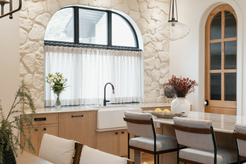
When designing a kitchen, small details can bring a space to a whole new level. When we talk about texture in design, you may default to thinking about the decorative pieces like fabrics and towels, or furniture pieces like chairs and barstools. But there are many ways to incorporate texture directly into the design of a kitchen.
Here are some of our favourite ways to add visual and tactile interest to a space!
1) Backsplash
One of the easiest ways to use texture in your kitchen. While we still see a lot of white subway tile, more and more homeowners are opting for tiles with variations in colour, pattern and finishes, etc.
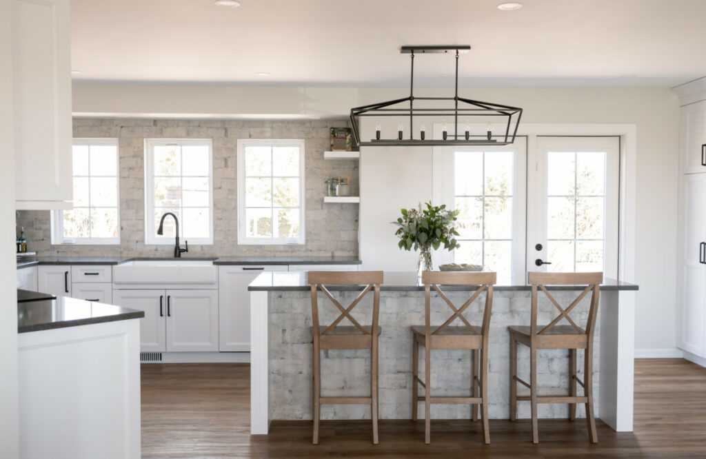
I personally love backsplashes that have really soft, neutral tones and show a lot of variation in colour and shape. Especially in a white kitchen, it can still achieve a clean, bright look, while creating visual interest. Or for something bolder, you can choose to match your backsplash to your countertops. By doing this, you can add plenty of visual interest, while still using a smooth piece that will be easy for cleaning.

2) Fluted & Reeded Accents
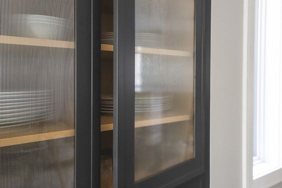
Fluted and Reeded accent pieces have been around for ages, but they’ve gained a lot of popularity over the last few years. From accent hoods to island panels and even cabinet doors, these accents can be very subtle or very pronounced. We’ve achieved these looks using routed HDF panels, or using tambour panels that come in a variety of profiles and sizes.
One of my favourite applications is to use reeded glass doors. It creates a nice balance of having a display cabinet without being fully transparent.

3. Prominent Wood Grains
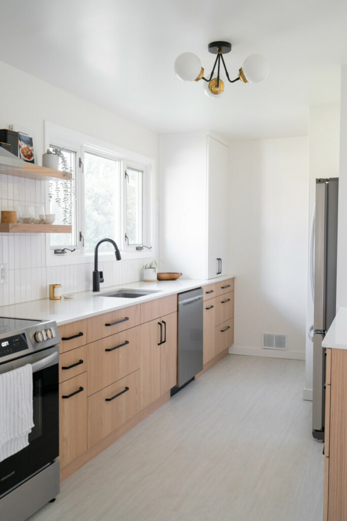
Gone are the days of the typical red oak kitchens. Most people are trying to get away from the all too familiar orange tones and raised panel doors. However, we don’t have to completely shy away from textured woods like oak. If planned out correctly, we can highlight the natural texture without letting it overpower a space.
For example, in this small kitchen, the oak slab doors have been stained in a light, natural tone, allowing the natural variation of the wood texture and colour. Pairing it with simple white cabinetry really helped make the space feel larger and more open, despite being a small galley layout.
4. Distressing & Antiquing
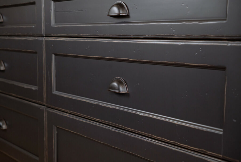
One of my favourite trends as of late has been antique details in cabinetry. Whether we order cabinetry with antique distressing or adding accents, there is something that feels so cozy and comforting in homes with these details.
Our antique distressing application looks beautiful on painted clear alder or stained knotty alder, if you like a more rustic look. Another personal favourite feature from recent projects has been using antique mirrored glass to accent small areas of a home. In our Hearth project, accent areas like the dining room bar, or the entryway hutch use antique mirrored glass to create a stunningly unique feature.

So, whether you want to be bold, or if you prefer a more subtle look, we’d love to help you design your next project!
Brooklyn Stein
Brooklyn joined the Two30Nine team after earning a bachelor’s degree in Environmental Design with a focus on interior design at the University of Manitoba. She loves to connect with her clients to create beautiful, functional spaces that they will love.

