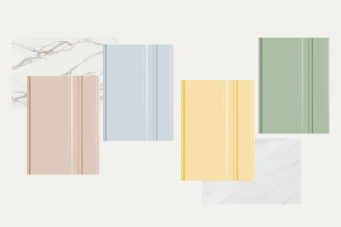
Spring Inspired Cabinet Colours
Spring has finally sprung here in Manitoba and we’re so ready for it. It’s the perfect time to dream about future projects, give your space a refresh, and let your kitchen dreams blossom. From pastel-coloured cabinets to floral textures, we’re buzzing with inspiration.
With the first day of spring arriving today, check out these projects inspired by a few of our favourite spring colours!
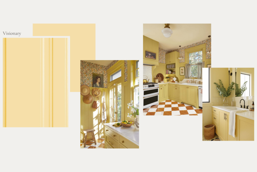
1. Visionary
Does anyone else feel as much joy as I do when looking at a yellow kitchen? They always look so cheerful and charming. One of my favourites is this quaint country kitchen by Maribeth Jones!
Every detail, from the decorative trims to the plate racks and open shelves add so much character to this home. Our pale yellow, “Visionary,” would be the perfect shade to recreate this style!
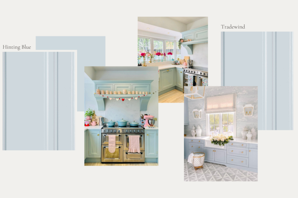
2. Hinting Blue
If a bright colour like yellow isn’t your style, you might like Louise’s blue kitchen (@thevintageroom on Instagram). Her soft blue cabinets, white countertops and large window create the perfect backdrop for all sorts of seasonal decorations, flowers, and pastel decor.
In nature, blue is the colour of the sky and water, so in interior design, it can be used to create a cool, calming environment. Particularly when using shades like “Hinting Blue,” you can add a pop of colour to your space without feeling overwhelming, especially in a smaller space like Louise’s.
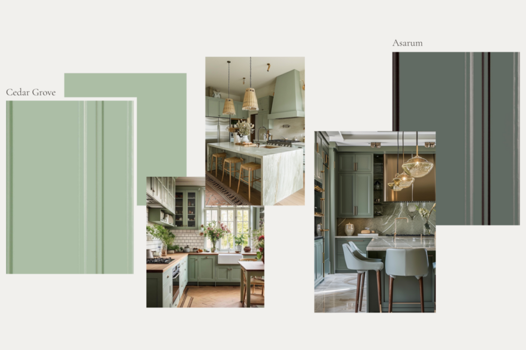
3. Cedar Grove/Asarum
I’m sure you’ve heard it many times now, but for many people green is essentially considered a neutral now. It has quickly become one of the most popular colours to use in interior design. I think our love of green also stems from nature, bringing a sense of serenity to many spaces.
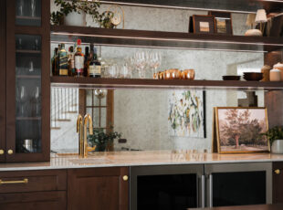
One of the best things about green is that it is so versatile. In particular, sage green is all the rage right now. Light, pale shades like “Cedar Grove” paired with wood or other natural textures can create a really cozy, welcoming space. While darker, cooler tones like “Asarum” can be paired with statement stone and contrasting metals for a more elegant and glamourous vibe.
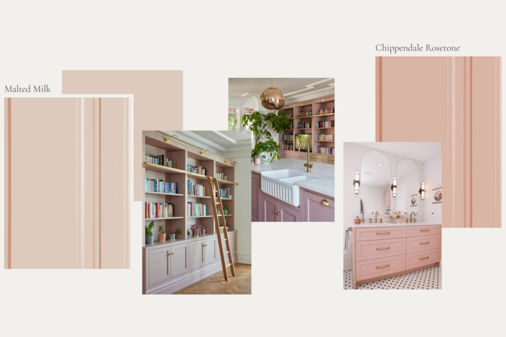
4. Malted Milk/Chippendale Rosetone
Okay, we all know that 2023 was a year of ‘Barbie’, and as a result, we’ve seen many people embracing more and more pink. While hot pink may be a bit too intense for some spaces, I’m loving seeing a surge in pale/pastel pinks. These pink tones can be used for soft, delicate spaces or can be used in a fun, retro style.
I have to say, I’m particularly obsessed with @the_pink_house_project and her pink cabinetry. Her kitchen is so cute and fun, and her library walls are a dream for any book lover.
It’s undeniable that colour can add a lot of personality to any space and thanks to our selection of standard paint colours available, you have so many options to fit your style!
Brooklyn Stein
Brooklyn joined the Two30Nine team after earning a bachelor’s degree in Environmental Design with a focus on interior design at the University of Manitoba. She loves to connect with her clients to create beautiful, functional spaces that they will love.